When the interface starts with intent

How intent-driven UX, adaptive UI, and generative UI work together in real products without making layouts unpredictable or hard to control.
Intent-driven user experience (UX) captures the goal, adaptive user interface (UI) changes a prepared experience, and generative UI assembles the view that goal needs. Keep a stable frame, generate only the parts that benefit from context, and give people a clear way to correct the result. When software can also act for the user, show the plan, progress, and undo controls before you celebrate the clever layout.
Intent changes the interface's job
Imagine booking a trip for two people who leave from different cities, meet during a stop, and have flexible dates. The goal is clear in your head. The booking site still asks you to search one route at a time.
So you open more tabs. You compare prices by hand, remember which dates line up, and repeat the whole exercise when one flight changes. The interface works exactly as designed. That is the problem.
Intent-driven UX starts with the outcome and lets the software work out the steps. A useful intent includes the goal, the constraints, and the limit of the software's authority. For our trip, that means finding compatible flights within a budget, while stopping before payment.
The related terms describe different parts of that flow:
- Intent-driven UX captures what the person wants to achieve.
- Adaptive UI changes content or controls using known context such as role, device, time, or history.
- Generative UI assembles a view at runtime from approved components.
- Agentic UI lets a person supervise software that performs several steps on their behalf.
These modes can share one product. A familiar button remains best for a small, frequent action. An agent can handle long background work. Generative UI fits the middle, where the request is specific enough to need a custom view and visual enough that a paragraph would be annoying.
Reordering your usual coffee should still take three taps. Nobody needs a planning agent for that.
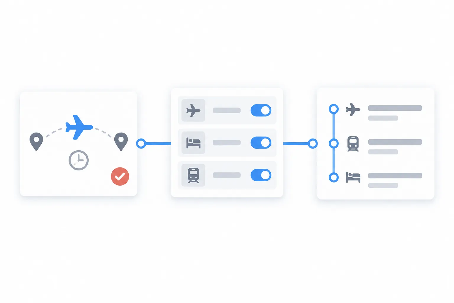
Example: one trip, three interface layers
- Intent-driven UX captures the request — two people need compatible flights from different cities, the dates are flexible, and the system must stop before payment. The interface gathers enough information to describe success without forcing the travellers through separate booking flows.
- Adaptive UI changes a prepared experience — it can prefill each traveller's home airport, prioritise flexible-date controls, or choose a compact layout on a phone. Designers created those patterns in advance. The system selects among them using context.
- Generative UI assembles the missing view — it can combine both routes into one itinerary board and add a price-aware date slider for this particular request. The components already exist, but nobody designed that exact arrangement beforehand.
An agent can take the next step by searching the routes, comparing the results, and preparing the booking. That turns the interface into agentic UI, so the product must show the plan and wait for approval before spending money.
The same split works in an analytics product. "Why did sales fall?" is the intent. An adaptive dashboard can open the manager's usual regional view. A generative interface can build a comparison chart for the products and periods involved in the drop. Each layer has a different job, even when all three appear on the same screen.
Keep the generative UI frame stable
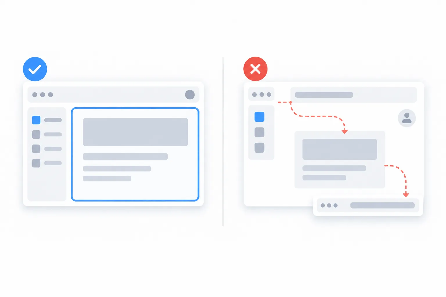
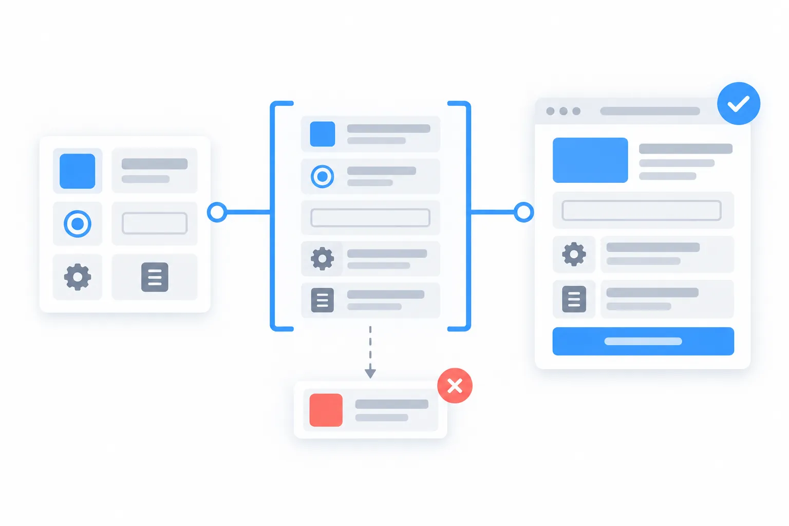
The safest layout is a fixed frame with a few generative zones. Navigation, account controls, brand elements, and system status stay where users expect them. The content inside a bounded area can adapt to the current goal.
Our flight page can keep its normal route fields and results list. When the dates are flexible, it can add a price-aware date slider. The next request may produce a comparison card instead. The page still feels like the same product because the structure around those controls does not move.
This approach also works for role-based dashboards. A manager may see a summary while an analyst gets the detailed view. On Monday morning, the finance user may see the report they usually review at that time. The system can lead, but the person still decides.
Generated interfaces are useful because they can match the answer format to the question. Google Research found that raters preferred model-generated interfaces over plain markdown answers 82.8% of the time (according to this guide). Generate the chart when it helps, and leave the settings button where people expect it.
Every adaptive zone needs a designed default. Use it when the system has little context, low confidence, or no safe component for the request. Also explain visible personalization in plain language: "Arranged for you because you review this report on Mondays." If every visit moves the furniture without explanation, users stop calling it personal and start calling support.
Give intent more structure than a prompt
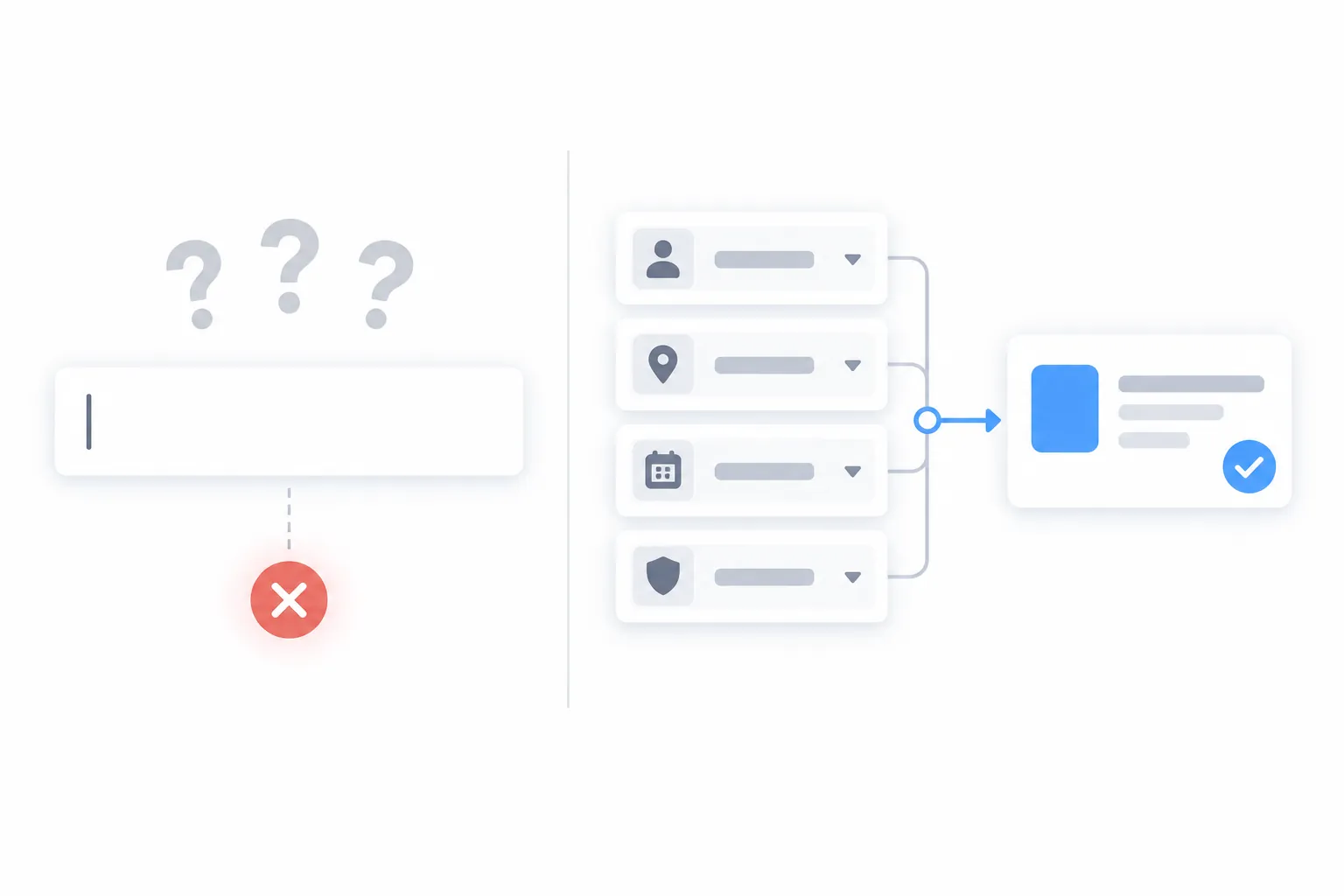
Replacing a large menu with an empty text box looks clean. It also asks every user to guess what the product can do and how to phrase the request. You have replaced a click hunt with a wording test.
Jakob Nielsen calls this the articulation barrier: people know what they want but struggle to express it in the form the system expects. The interface should help them discover a valid intent instead of grading their prompt-writing skills.
A practical intent entry point combines free text with structure:
- Offer a few likely goals for the current page or role.
- Prefill context the product already knows, then let the user correct it.
- Ask a narrow follow-up when a request is ambiguous. "By region or by product?" is better than a confident guess.
- Keep normal navigation for people who want to browse.
A phrase such as "I am a [role] looking to [goal]" is often enough. It gives the user a starting point and gives the system clean inputs. The goal box becomes another route through the product alongside the menu.
This matters most on mobile. Typing a careful prompt on a phone is slow, and the keyboard covers the screen while you do it. Chips, selectors, recent goals, and good defaults remove work without hiding available options.
Agents need visible controls
A generated screen presents information. An agent can spend money, send a message, or change data. The second case needs more friction in the right places.
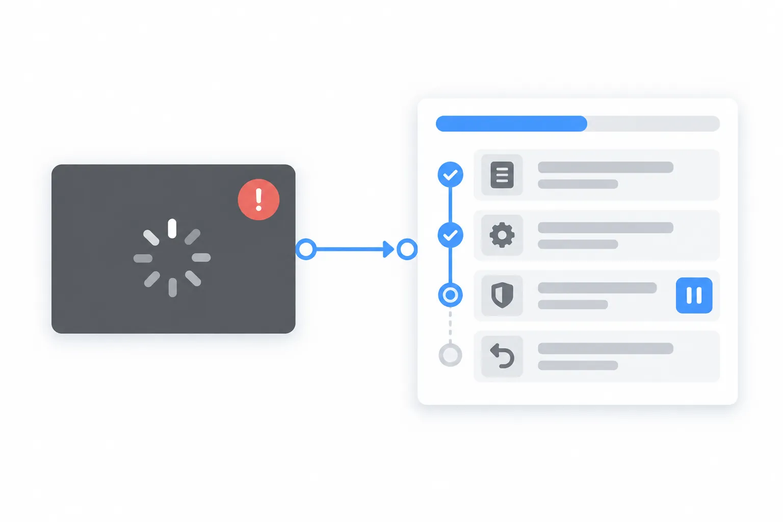
Show the plan before a consequential action starts. While it runs, report useful progress such as "comparing 14 flight options" or "checking three calendars." A spinner tells the user that the spinner works. It does not say whether the agent is making progress or planning a small disaster.
The interface should expose four controls:
Plan — show the steps and let the user remove or edit one.
Pause — allow the work to stop without losing the whole task.
Record — keep an audit trail of actions, inputs, and results.
Undo — reverse actions when the underlying system allows it.
Approval should follow risk. Cheap and reversible actions can run automatically. A purchase, deletion, or external message should pause for confirmation. Asking for approval after every harmless step trains people to click "Allow" without reading, which rather defeats the point.
Layout helps here. Keep the goal-setting conversation beside an activity panel that shows the agent's work. One endless chat thread is poor at both jobs. The user should be able to see what they asked for, what is happening now, and what already changed without scrolling through a novel written by a status log.
The design system becomes a runtime contract
When a model assembles the view, your design system becomes an application programming interface. Components need semantic names, clear usage rules, validated properties, and complete loading, empty, and error states. button-primary-background tells the system more than blue-500.
For most products, use controlled generation. Give the model an allow-listed component registry, let it select a component, and validate the properties before rendering. A declarative approach can go further by letting the model produce a structured interface description that the client maps to native components. Agent-to-User Interface (A2UI) and Agent-User Interaction (AG-UI) are examples of this growing protocol layer.
Letting a model write raw web code offers more freedom, along with a larger security and quality problem. Keep that option inside a sandbox for exploratory tools. Your account page is a poor place for improvisational theatre.
The quality gap is already measurable. The Design Theater benchmark tested 120 interfaces from five generative tools. More than 25% of the design rationale presented by the tools did not appear in the result, and the gap reached 34% for functional requirements (according to the paper). Review the rendered behavior against the requirements. Treat the model's explanation as commentary.
Runtime details matter too. Stream updates into scoped state so one token does not rerender the whole page. Reserve space for incoming components to reduce layout shifts. Announce meaningful updates through accessible live regions, manage focus when dialogs appear, and return focus when they close. Generated UI should assemble accessible components you have already tested.
Start with one bounded zone
Do not begin with a homepage that reinvents itself for every visitor. Pick one task where the product already has useful context and the current interface creates visible friction.
Then work through five steps:
- Write the intent as an outcome, constraints, and an authority limit.
- Mark which parts of the screen stay fixed and which one zone may change.
- Map likely intents to approved components with validated inputs.
- Add a designed default, a reason for the adaptation, and recovery controls.
- Test task completion, keyboard and screen-reader behavior, performance, and failure states.
This small rollout makes wrong decisions easier to see and cheaper to fix. Keep the first release narrow enough that your team can inspect every generated state.